Puckababy
STatus
Freelance Creative & Graphic Designer
Client
Puckababy
brand manager
Fania Van Meirhaeghe
Visual identity development of premium sleeping & swaddling bags from newborn to kids.
Read more
CHALLENGE
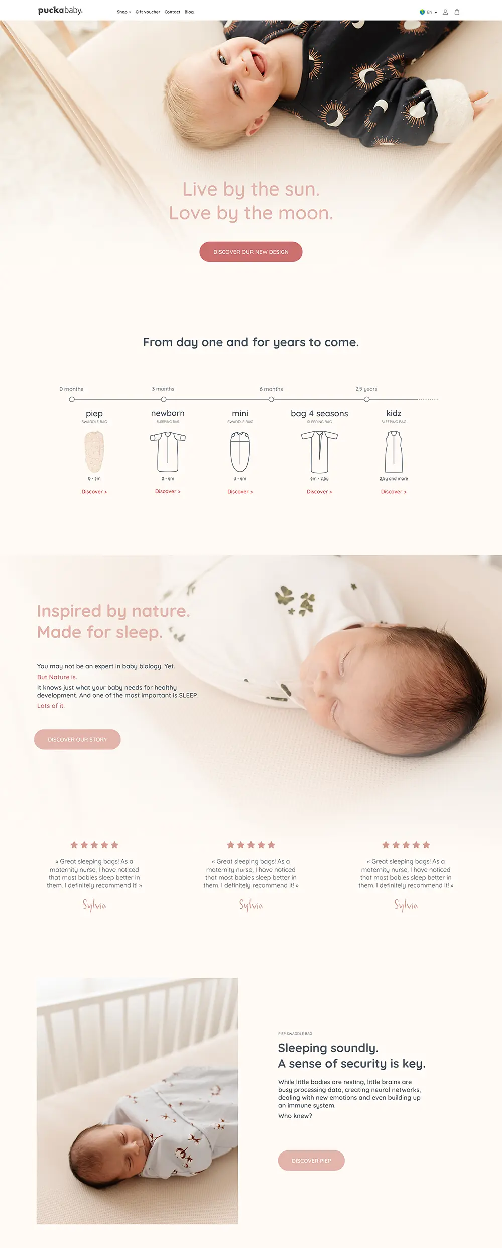
Puckababy skyrocketed on a short time with all of their visual identity based on a rudimentary 8 pages guide: logo, colour palette & lettertypes. There wasn’t any clear direction on the brand identity, from values & positioning to the tone of voice & visual design.
Puckababy’s collaborators were missing a brand bible, giving them much needed intel and guidelines on who the brand is, what it wants to communicate and how to communicate it.
PROPOSITION
Th brand manager did a first analysis on the brand’s identity & strategy.
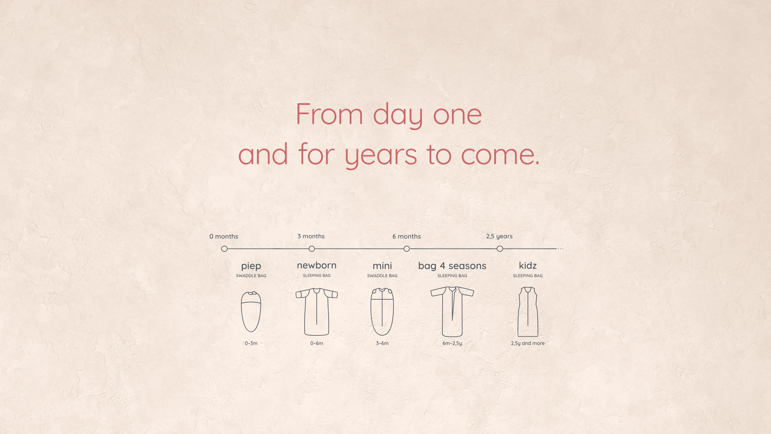
The focus had to be put on the expertise of Puckababyin creating safe sleeping solutions for a healthy development from birth til 7 years old.
Following her results, we analysed the visual identity: what was working well and made sense with the brand’s identity? We selected the best elements and systems, updated or expanded them, and clarified the grey zones.
We summarised and structured the whole analysis and updated branding in an 86-pages brand bible, both for new-comers and experienced collborators, as a tool to learn everything they need to know about the brand or as a reference.
The brand book compiled: Brand story, vision and values, infos about the brand, about the products range; editorial identity, visual identity; design system guidelines, photography guidelines, … All with a word of explaination, use examples, do’s and don’t’s and/or templates.
